The Relation Between White Space and Concept Maps
by Christopher Cimino, MD, FACMI, VP of Medical Academics, Kaplan Medical | April 23, 2021

What Knowledge is Found in White Space?
“White space” is the term printers use to describe the empty space on a page. This includes the space between words, blank lines between paragraphs, the margins at the edges of the page, and blank pages at the end of chapters or at the beginning or end of a book. Is it nothing? Is it wasted space? Well, it’s actually not “nothing,” because if you took the white space all away you’d find it very difficult to read. Imagine a newspaper with no space between the columns. Or imagine black and white pictures printed on black paper.
Removing the white space leads to a loss of information, and yet, questions still remain:
Does that prove the white space contains information?
How can we decipher and interpret that information?
Is it worth the effort?
Some might say this is just semantics. The loss of information is not because we removed the white space, but because we introduced noise. If we were listening to a concert and someone introduced other sounds in between the notes, it would result in audio nonsense as chaotic as our newspaper lacking column gaps. The analogy doesn’t fully fit; however, and it would be fairer to imagine we removed the timing between the notes. Now our concert will still sound like something, just not what we expected when we looked at the program. Let’s accept that there is minimal information that a tabula rasa provides, which is the invitation to provide more information.This seems only barely more than a semantic distinction.
At the other end of the spectrum is another semantic issue I’d like to set aside. The extreme example is the blank page as a message. I’ll let you think about that for a bit.

Somewhere in here is the issue of “medium as the message.” The conveyance of our message communicates something. In education, the obvious example is what I have talked about previously―some knowledge is better conveyed visually. That is true for video and auditory knowledge as well. Rene' Magritte was famous for these types of messages. Magritte’s messages were very thought provoking though rather than educational.
What is “Significant Information”?
As I list all the things I am not focusing on, you might say what has come before has been filler or absence of information; a kind of written white space. What I am interested in is white space that adds “significant information”. A simple example is a table. I think a table makes use of white space in 4 different ways to add information:
(I) If we imagine the information written out in prose as a single long paragraph and then reorganized into a table, it is apparent that the prose can contain the same, maybe even more, data than the table, but the table is better at conveying the information. Some of that is just improved readability which is our first kind of added information. (That is the main function of white space, after all.)
(II) Some of the added information is that spatially laying out the facts reveals relationships, both similarities and differences.
(III) A third type of information added is the author’s choice of column and row definitions. It sets forth one person’s opinion of what the best organizing principles are.
(IV) Finally, having chosen a set of organizing principles, the resulting organization can reveal patterns in the data as they relate across all the content.
For Example:
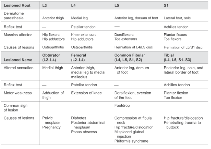
(I) Consider a table of lumbar radicular lesions that indicates innervated muscle groups and reflexes in the lumbar plexus. This same information written as a single long paragraph would be pretty daunting.
(II) Looked at spatially, we can readily see how L3 root lesions result in specific findings and how this overlaps or is distinct with Obturator and Femoral nerve lesions. Reading across, we can see motor and sensory functions that should be evaluated when assessing a lumbar root or nerve lesion. The information is compact and readily apparent.
(III) The organizing principles chosen represent a simplification of the information that is more easily digestible than reality. Whenever an organizing principle is chosen, there is almost always a loss of information or a simplification. The nerve roots seem reasonable enough but in fact, each nerve root includes innervation to and from overlapping dermatomes.
Those looking to master a greater degree of accuracy would read up about Lissauer’s tract and how these fibers travel up or down a level from the nerve root they enter. For the novice though, this level of simplification is acceptable and assists with mastery which can hopefully be expanded and made more accurate later. (This would sort of be like learning a language without worrying about the subjunctive tense right away.) The list of major nerves complements the nerve roots and implies the way in which each root contributes to each nerve. The overall organization left to right is anatomical. The two major divisions from top to bottom are also anatomical. The minor divisions top to bottom are functional.
A different author might have chosen function as the major division separating motor and sensory findings. This would be a different organizing principle. Such a table would have the same information, but would it serve the same purpose?
(IV) The answer is “no”, and can be found when we start to look at the 4th type of information that is being conveyed. As with the nuances of Lissauer’s tract, the details are a bit messy or fuzzy. Looking at the table we see some partial patterns in the way words occur throughout the table. Upper lumbar roots are prone to osteoporosis. Lower roots are prone to herniation. The distribution of paresthesias as one moves to lower roots follows a suggestive pattern that just eludes our categorization. (A graphic representation would make this more apparent where we would see that the dermatomes are a result of the embryologic rotation of the leg as it develops. Tables aren’t perfect for everything.)
The absence of information (more white space) makes it apparent that using reflexes one can not distinguish between root and nerve lesions and certain nerves and roots can’t be easily tested. The point here is that these partial patterns stimulate more questions which in turn stimulate a deeper understanding of the overall content. This is similar to the claim sometimes made about concept maps.
Is a Table a Concept Map?
For those used to working with concept maps, a table is nothing like a concept map. For those only partly familiar with concept maps, a table is easier to create and reap a benefit. For those unfamiliar with concept maps, they are worth learning about. It is literally a map of how concepts or facts are related to each other. It has a lot in common with “semantic networks”. Here's an example:
For example, we could place the idea of “extensors” and “flexors” on our map and then place the concepts “brachioradialis”, “triceps”, “iliopsoas”, and “hamstrings” and start connecting all these terms in a way that indicates which muscles are extensors and which are flexors. We could add “upper arm” and “lower arm” and add more connections. We could wander off into “decerebrate posturing” and “decorticate posturing” and to many other concepts besides and soon have a mess of interconnections that should remind us of the picture printed on black paper mentioned above. This is not a useful concept map, but does approach the function of a semantic map.
The vast number of interconnections might overwhelm our perception, but would only present a quantitative problem to a computer. In a sense, a semantic network provides a computable definition of the information it contains.The computer would be able to answer both the question “What is the triceps muscle?” and “What is the major extensor muscle of the upper arm?” There is some evidence that our brains are organized along the lines of semantic networks with specific areas for facts (nouns) and relations (verbs).
I see a continuum between well-written prose, the organization of a well-designed table, a well-designed concept map, and a semantic network of computable definitions.
The semantic networks are leveraged with machine learning algorithms for things like autocompletion and optimizing search results. If we imagine adding some white space to them, or pruning them, they can help our less algorithmic-minded brains. Tables start from the other direction. They are easy to construct because we limit ourselves to a relatively small number of relationships. If we are lucky in picking the right initial relationships, then it feels like our table builds itself. The same thing that makes them easy also makes them constrained and limiting. We start to discover all the exceptions to the partial patterns that don’t quite fit in the tables.
Concept maps fall somewhere in between. We don’t try to capture all the facts and relationships, just the most important ones. What many proponents of concept maps will tell you is that as you build them, you will discover the organizing principles and the more you build concept maps, the better you will get at it. This is poor advice for the anxious student who wants to believe this will help them, but only feels they are spending more time than they normally would on a topic and not making much progress.
How Do People Create or Find “Organizing Principles?”
It is true that looking at a collection of similar and related information, people can be very good at seeing patterns. We generalize and make distinctions instinctively. A walk through a parking lot will grab our attention when we see a motorcycle, a three-wheeled car, or a sub-sub compact car―unless we live somewhere where those things are frequent. If someone is asked what you would expect to find in a parking lot, most people would answer cars. On the other hand, if we asked people to list all the things besides cars you might find in a parking lot, a fairly long list could be generated. In the absence of a specific goal, our brain will still attempt to provide an organizing principle to simplify what we are seeing, if only so it can ignore the generalization as white space to be ignored.
Try the following exercise. Using just your imagination, visualize walking through a parking lot. Imagine you are looking for “your car”. I’ll let you think about that for a bit.

Having done the exercise, now answer the question, “What was the predominant color of the cars in the imaginary parking lot?” The responses people give reveal some interesting things. Some people will have no special color in mind while others will. And still others will impose a default color, but only after the question has been asked (sort of like trying to remember a dream on waking, and then wondering if that happened in the dream, or you only supplied that explanation after waking.) Black, gray, white, blue, and red are common colors. If it was an average of all cars we’ve seen we’d expect the color to be brown but that’s not what most people report.
It is also true that repeated attempts to find patterns in the things around us will improve and diversify our ability to generalize and categorize. However, there are steps to get better at this faster. Now do the same exercise except instead of looking for your car, look for the most unusual car in the imaginary parking lot. How do the colors in this parking lot compare to the previous parking lot? Likely you “found” an unusual car only to realize there was an even more unusual car to be found. You likely found yourself in a parking lot with more unusual than mundane cars. If it had been a real parking lot, the cars would be universally more mundane but you would be likely to notice subtle but unique features you wouldn’t notice if you were just looking for “your car”.
Step 1: Decide what purpose this map is supposed to serve
What this exercise suggests is that the first organizing principle for creating a table or a concept map is to decide what purpose this map is supposed to serve. What questions might it need to answer? You can’t know for sure the perfect question to focus on but consider these possibilities:
How will this information help me be a better physician?
How will this information help me understand recurring principles of basic science?
How will this information help me pass the test?
Step 2: Start Adding Concepts and Connection
With a focus in mind, the second step is to start adding concepts and connections. A concept map allows these to be anything while a table will need you to decide early on what the row and column organizing principles should be. Having chosen these principles for a table, extending the table becomes easy and usually has a clear end. With a concept map, adding new information in different ways is easy but it can be unclear what the endpoint is.
Step 3: Start Looking for Generalizations and Outliers
The third step is to start looking for generalizations and outliers. Can the common elements be grouped to reduce complexity? Are the outliers important exceptions or just tangential elements that can be removed and placed in some future table or location? In a table this can mean repositioning entire rows or columns to bring similar or contracting information into conjunction or imposing a useful order so finding information is easier (e.g. alphabetic or numeric.)
Step 4: Step Back and Rethink What You Created
The final step is to take a step back and rethink what you created. Are some parts too detailed suggesting maybe they need to be simplified? Are parts of the information unclear or confusing? Does the lack of clarity suggest some better organizing principles? If you are creating your tables in a spreadsheet to begin with it can make reorganizing, trimming, and grouping can be less onerous. Concepts maps are all about reorganizing and probably the part newcomers dislike the most. There is software to make different aspects of this less onerous as well so it might be worth trying a few out before settling on one.
How White Space Improves Understanding
But really, what would an article about white space be without an example that shows how white space improves understanding?
Organizing principles for efficient knowledge representation
- What is the purpose it will serve?
- What are the broad groupings that capture most information?
- Is there a level of detail that would be useful for general, intermediate, and expert levels? What information drops out at the expert levels?
- What is the less essential information that can be ignored to serve the purpose?
- What is the optimal amount of interconnections that reveal interesting connections without being overwhelming?
- How many levels are useful in your hierarchy and can greater delta be spun off into separate organizing efforts?
Whitespace is really about directing focus to specific material. The skillful use of whitespace is an essential tool when confronting the massive amounts of information such as we deal with in medical education. It is the invisible knowledge that keeps us from drowning from information overload.

Dr. Cimino has earned a reputation internationally as an award-winning medical educator. He was the founding Assistant Dean for Educational Informatics at Albert Einstein College of Medicine and former Associate Dean for Student Affairs at New York Medical College. He is board certified in Neurology and Clinical Informatics. He served as a member of the NBME Step 1 Behavioral Science Committee and the NBME End of Life Care Task Force.
See more posts by Christopher Cimino, MD, FACMI, VP of Medical Academics, Kaplan Medical