Visual Aides and Cognitive Theory
by Christopher Cimino, MD, FACMI, VP of Medical Academics, Kaplan Medical | November 10, 2020

Much is written about the difference between quantitative processes and qualitative processes, but I think an excellent example of how the former transforms into the latter is the medical school curriculum. The quantitative approach would be that the student needs to learn twice as much, or 5 times as much, or 10 times as much (pick your quantity) per week compared to what they did in college. That would imply they simply take what they did in college and multiply their effort to increase the quantity of material covered.
People used to measure the difference by stacking up a semester’s worth of college books and notes next to a semester’s worth of medical school books and notes. Alas, a laptop is always the same height no matter how much content you put in it, so the exercise loses some of its impact.
Student Study Woes Becoming a Qualitative Problem
Anyone who has watched students struggle in the first month of medical school will attest to the fact that their study woes have shifted from a quantitative problem to a qualitative problem. The strategy to multiply the amount of time they spend studying requires they forgive themselves for all the material they will never get to. This change in behavior is the first sign that this is a qualitative problem. The second sign is students trying to identify what they can skip: “Will this be on the test?” These two strategies by themselves are rarely enough to succeed.
Since most students will inevitably need a qualitatively different approach, is there a shortcut to affecting the right behavioral changes? Some schools administer a Myers-Briggs Type Indicator assessment. Others use a VARK (visual, auditory, reading (and writing), kinesthetic) Inventory or one of several learning style questionnaires.
The theory seems sound. You should be more aware of the strengths and weaknesses of your cognitive abilities so you can optimize your learning. If someone is a visual learner then they should transform their reading into pictures or diagrams. They should do the same to the lectures they hear. For example, students could sketch their anatomy dissections instead of being so focused on simply doing the dissection.
Content Should Have a Preferred “Learning Style”
The theory isn’t completely wrong but there are two problems with it as it applies to medical content. Consider the following math problem: We have a cube that is exactly 1 unit wide, deep, and high. What is the largest cube we can pass through a hole in our unit cube while keeping our unit cube intact? This problem was first posed by Prince Rubert of the Rhine.

© Kaplan
The simple answer could be to cut a hole in one face through to the other side in which case the hole could be almost, but not quite, 1 unit.

© Kaplan
But of course, this question must have an unexpected answer otherwise it wouldn’t be worth posing. Suppose the hole doesn’t pass through from face to face but instead from corner to corner. Is there a cross-section along that axis that is wider than 1 unit?
Now consider asking a student to solve this as a word problem versus as a visual problem versus as a kinesthetic problem versus as an auditory problem. To this, we should probably add mathematic, animation, virtual reality, simulation, and other modern modalities. It seems clear that regardless of a student’s cognitive strengths, certain approaches will be more successful. Not just the student, but the content has a preferred “learning style”. What happens when the content preferred learning style is a mismatch for the student’s preferred learning style?
Accommodating Diverse Learning Styles with Diverse Teaching Styles
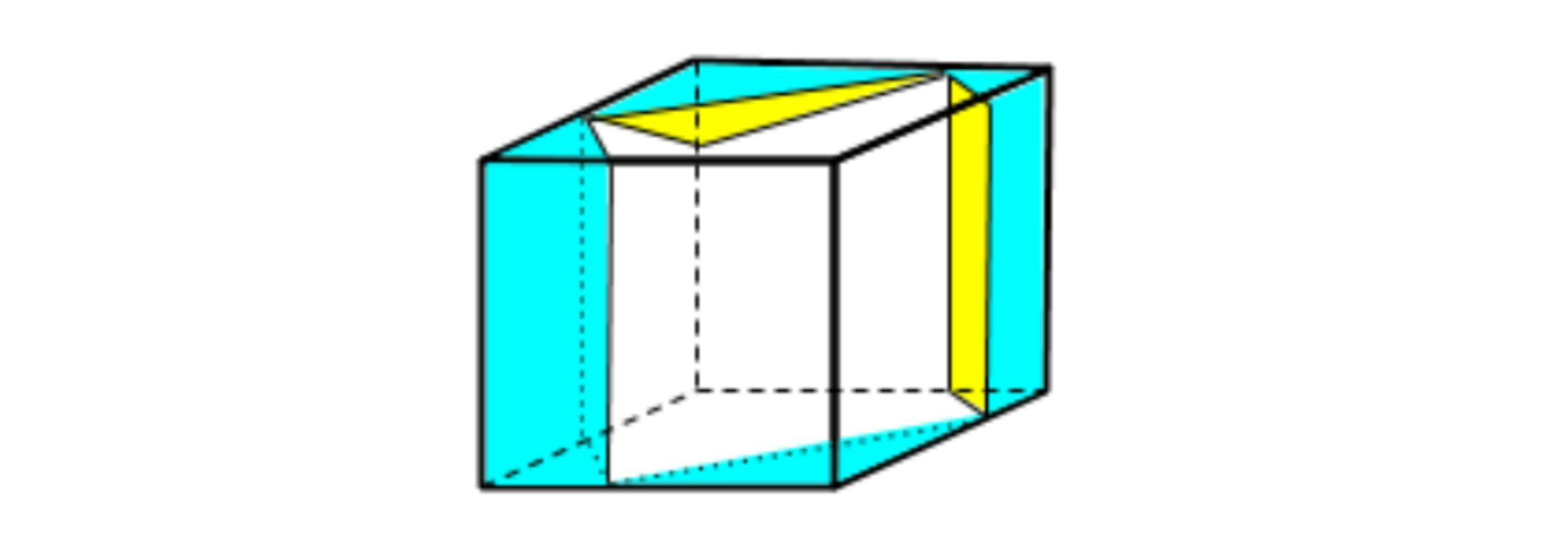
Let’s take our example a little further. One might think a mathematical approach would be best. We have the coordinates of each corner ([0,0,0], [1,0,0], …[1,1,1]). With an algebraic solution it is possible to define the three-dimensional space and solve for the largest square cross-section. However, it would be tremendously difficult to work out using a pencil and paper. A visual approach has better success. We rotate the cube so we are looking along the axis from corner to opposite corner. The silhouette of the cube forms a regular hexagon. The edges are foreshortened so they are shorter than one unit but the cube face diagonals are not foreshortened. They remain length √2 units (~1.414) and so the parallel edges are that far apart. This puts us on the path of a promising approach. How easy is this to follow verbally? And how easy if we have a visual representation?

© Kaplan
Having established this seems like a good approach, the mathematical solution is much more straightforward by calculating the size of the largest square inscribed in the hexagon (using a dissection of right triangles) to arrive at a cube size of (√6-√2) units (~1.035). And so John Wallis proved the passing cube can be larger than the enclosing cube!
Learner Learning Styles Versus Content Learning Styles
Let’s think a little further about learner learning styles versus content learning styles. To get as far in the solution as we did, we needed to use a combination of learning styles, both visual (visualizing the largest silhouette and cross-section) and mathematical (using the Pythagorean Theorem to calculate the sides of the inscribed square). The Pythagorean Theorem is itself a fundamental example of this phenomenon. Most Pythagorean proofs rely on both the visual and mathematical methods.
Is medicine more or less complex than this fundamental geometric proof? If we believe that medicine is more complex than high school geometry, then how can we justify ever presenting medical content with only one learning style?
Understanding Medical Concepts Through Well Crafted Visuals
There are few medical concepts that can’t be better understood with well crafted visuals added.
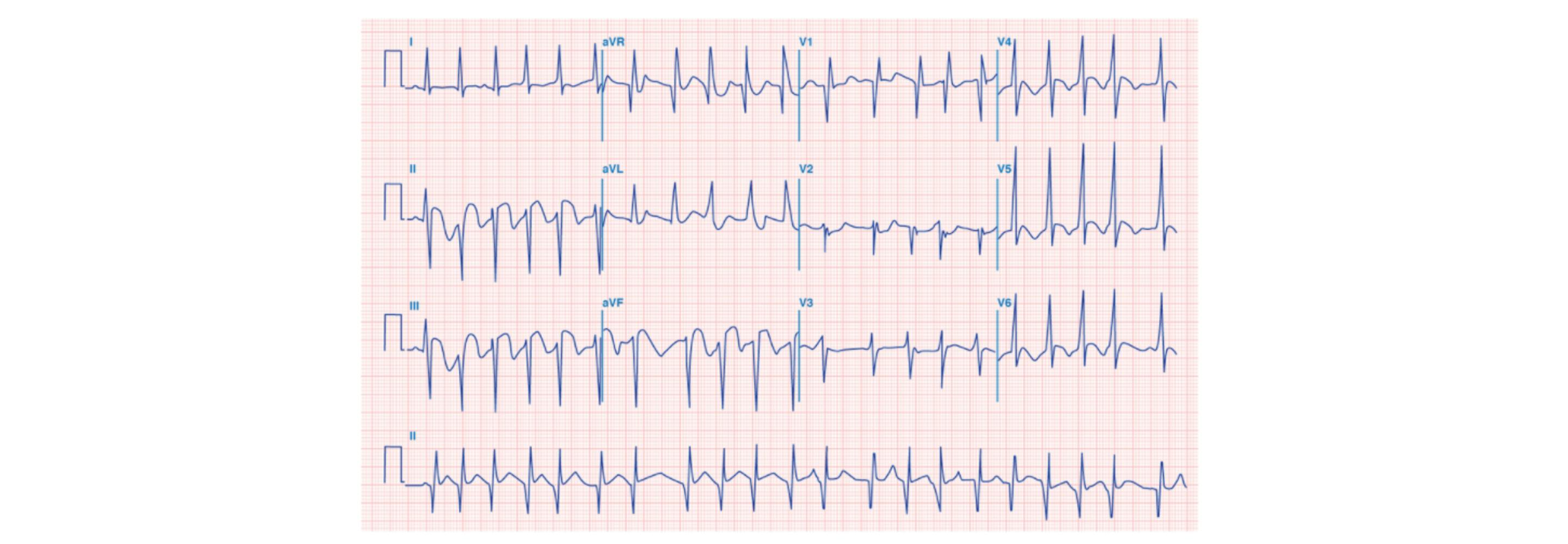
Consider the electrocardiogram (ECG). It gives us multiple unidimensional views of voltage values across time as measured between pairs of electrodes. The pairs of electrodes also separate the activity by location as represented by the different squiggly lines.
© Kaplan
Introductory content for ECG gives a nod to this geometric relationship with diagrams showing the placement of electrodes, the path of cardiac muscle depolarization, and the “axis” of each recording. These diagrams may surface again when looking at the differences between myocardial infarction locations. We are taught to look at which axis corresponds to the greatest ST-segment elevation to help localize the infarct. Strangely we don’t see these diagrams discussed when talking about ST-segment elevation, inverted T-waves, or widening QRS-complexes.

(Attribution Wikicommons User Bron766)
Are educators ambivalent about whether this visualization is useful for those other problems? Or maybe they feel these visualizations will be useful to a small number of students who already have great visuospatial learning skills. Those students can then pursue further understanding on their own. Or perhaps the creation of the necessary visualizations requires too much effort for the majority of educators.
Visual Aids Can Be a Thing of Beauty
An elegantly crafted visual aid is a thing of beauty. Paradoxically, it’s value is in how easy it makes the concept seem and, by extension, we are fooled into thinking that creating it was easy. Perhaps that explains the hurdle educators face. Maybe the right tools aren’t readily available? Or maybe tools powerful enough to create the desired visual are too complex for someone whose primary tasks are very different than illustration. Ironically, the basic and intermediate tools built into presentation software can restrict creativity into a generic mold that doesn’t reach the goal. A sketch on a napkin can end up being more flexible but a bit harder to share digitally. Or maybe after herculean efforts the creator gets a, “that’s nice”. That can be discouraging to future creativity. (I’d like to hear from people what they think the issues are that deters the creation of visuals.)
Did John Wallis feel disappointed with his result? He didn’t even get the resulting cube named after himself. Nor did Pieter Nieuwland. The idea that we can take a cube and pass another cube, 3.5% larger, through the first cube seems strange. Is that the largest possible cube? It took about 100 years to prove it wasn’t. Rotating our cube to look from corner to corner gave us a regular hexagon silhouette. Pieter Nieuwland recognized that as we rotate our cube from an edge view we see irregular hexagons until we reach the corner view. If we keep rotating the hexagons become irregular again. The inscribed squares for the regular hexagon is larger than the inscribed squares at the start and end of the rotation, but is it the largest? It turns out the maximum is not in the middle of the rotation but closer to the point where the width and height of the irregular hexagon is equal.
© Kaplan
Not surprisingly, the path to the ultimate solution required multiple content learning skills including more visualization. Prince Rupert’s Cube is about 6% larger than the cube it will pass through. Maybe this is a metaphor for the amount of medical knowledge we are trying to cram into students’ heads.
Dr. Cimino has earned a reputation internationally as an award-winning medical educator. He was the founding Assistant Dean for Educational Informatics at Albert Einstein College of Medicine and former Associate Dean for Student Affairs at New York Medical College. He is board certified in Neurology and Clinical Informatics. He served as a member of the NBME Step 1 Behavioral Science Committee and the NBME End of Life Care Task Force.
See more posts by Christopher Cimino, MD, FACMI, VP of Medical Academics, Kaplan Medical